Aga Khan Foundation

UI Design Lead

Overview

Client
Aga Khan Foundation
Timeline
Jun 2018 - Feb 2019
My Role
UI Design Lead
Team
UX: Alysha Jivani, Ali Thanawalla, Karishma Merchant, Asma Alibhai
UI: Inaara C (me), Noureen Dharani
Background

The Aga Khan Foundation (AKF) is a branch of the Aga Khan Development Network (AKDN), a charity that works in over 30 countries to address a number of challenges affecting the world's poorest and most marginalized communities. In an effort to raise funds and awareness for AKF while simultaneously encouraging physical activity, they began a new initiative which includes a "walk for charity" app.
The Challenge

Design a "walk for charity" app that emulates traditional charity walks. This app should help raise funds and educate users about AKF’s work around the world.
My Responsibilities
I was the UI Design Lead for the first nine months of the project, and developed the UI design guide and assets used by other designers. Some of my responsibilities included:

1. Developing the app's UI design guide and hi-fidelity screens
2. Critiquing UX design decisions during weekly team meetings and when making hi-fidelity screens
3. Directly working with engineers/developers to discern feasibility
Product Impact & Goals
This app has just launched and is currently available on the App Store. With marketing efforts currently in place, the target is 250K users. Our goals for the product include —

1. Encourage physical activity and improve wellness of users
2. Raise funds for AKF to support marginalized communities
3. Educate users about AKF's work in other countries

Research

Due to the demands from the client and short timeline, the project manager pushed for a short initial research sprint, in order to make time for usability testing later in the process. As such, we chose to consolidate feedback from a beta app AKF previously launched and analyzed related products currently in the market.
“Walk to Dubai” App Feedback
The AKF engineering team had previously released a beta version for a similar app concept called “Walk to Dubai,” which was an individual activity tracker. Feedback from users of the previous “Walk to Dubai” app were reviewed and key insights were synthesized.
Key Insights:
1. Having to manually enter miles into the app deterred users from continuing to use the app
2. Users felt unmotivated to meet their goals due to the game's individualized play, lack of rewards/incentives, and manual mile entry
3. Lack of trust in the app due to manual mile entry and unappealing UI
Existing Product Analysis
We also gained inspiration from a number of existing solutions that we each found compelling. These sources of inspiration included fitness apps, charity for fitness apps, and wellness apps.

Ideation

To make sure things were moving efficiently, the design team was split into UX Designers and UI Designers. The UX Designers focused exclusively on the overall structure for the app, discerning features in each tab, and developing lo-fidelity wireframe/wireframe details. Since the UI designers also had UX experience, they were to provide critique to the UX during weekly meetings, develop the UI design guide, and convert the lo-fidelity wireframes/feature details provided into hi-fidelity screens. 
UI Design
Given the team's preference for my UI design proposal, I was selected to take lead of the app’s UI Design. I used AKF’s existing brand guideline as a starting place for our app’s UI, and introduced new colors/styles where appropriate.
User Flows
Given user research and client considerations, each designer developed their own idea of the user flow for the app. We discussed and consolidated these, and began to create user flows for each tab in the app. The flows were iterated on as we provided critiques and user tested.

Prototyping

While the UX Design team worked to complete various lo-fidelity wireframes, the UI/UX Design team converted completed lo-fi screens to hi-fidelity. The UX designers were responsible for user testing to gather feedback while iterating on their designs.
Lo-Fidelity Screens
The app consists of four main tabs (Dashboard, Challenge, Leaderboard, and Notifications). The lo-fidelity screens and tab feature breakdown provided by the UX Design team to the UI/UX Design team are roughly presented here:
Hi-fidelity Screens
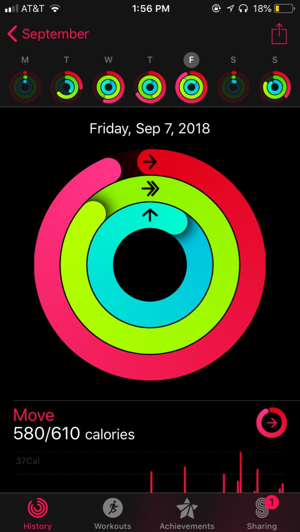
The lo-fidelity wireframes were then converted into hi-fidelity screens. As a UI Design Lead, I made changes where appropriate when making the hi-fidelity screens based on my knowledge of the experience, ‘hallway’ user testing results, and collaborating with developers. Here are a few examples of the screens I designed/created assets for:

Basic UI Guide
The colors chosen were inspired by the current AKF brand guidelines. For the bar charts/graphs, we chose to use slightly brighter colors in order to provide a clearer indication to the user. We also chose to stick with the app’s native font for both iOS and Android devices, to make development easier.

Reflections

Given that I was the only undergrad on the team, it was really valuable learning from UX designers working full-time with experience at companies like DirectTV, Home Depot, AT&T, and Google.

Having my UI design proposal chosen and being selected to lead the UI Design was exciting, given that I was working with a pool of super talented designers! It also gave me a great opportunity to work directly with developers, where I gained a valuable insight into the various constraints that come with developing an app.

I really enjoyed my time working alongside the team (designers, engineers, project manager, and client) that made this project come to fruition. And now, the app is currently available on the App Store! With the marketing push underway, I am excited to let you know how things go, so stay tuned!