Prototyping

While the UX Design team worked to complete various lo-fidelity wireframes, the UI/UX Design team converted completed screens to hi-fidelity. Each team was responsible for ‘hallway’ user testing to gather quick feedback while iterating on their designs. As a UI/UX Designer, I provided ideas for potential concepts/features, feedback and input while the lo-fidelity wireframes/features were being developed, as well as made changes to the final screens given my findings with user testing and my understanding of the desired experience when converting the screens to hi-fidelity. Once a tab’s hi-fidelity version was completed, they were handed off to the developers in order to discern feasibility, get feedback, and begin developing.
Lo-Fidelity Screens (in progress)
The app consists of four main tabs (Dashboard, Challenge, Leaderboard, and Notifications). The lo-fidelity screens + tab feature breakdown provided by the UX Design team to the UI/UX Design team are roughly presented here:
Hi-fidelity Screens (in progress)
The lo-fidelity wireframes were then converted into hi-fidelity screens. As a UI/UX Designer, I made appropriate changes to the hi-fidelity screens based on my knowledge of the experience, own ‘hallway’ user testing results, and collaborating with developers.
Visual Design
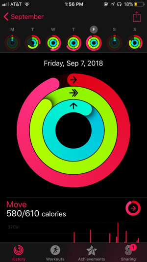
The colors chosen were inspired by the current AKF brand guideline. For the three graph display colors, we chose to go slightly brighter in order to provide a clearer indication to the user. We also chose to stick with the app’s native font for both iOS and Android devices.


